At Bridge Suisse, we are excited to share a significant milestone in our journey – the unveiling of our new company logo. This fresh visual identity represents our commitment to growth, evolution, and an unwavering dedication to serving our valued clients and partners.
Why the Change?
Our decision to refresh our logo was not taken lightly. We understand the importance of maintaining a strong brand identity while also adapting to the evolving demands of our industry and the global market. With this in mind, we embarked on a journey to create a logo that captures the essence of Bridge Suisse in a contemporary, meaningful way.

The Design
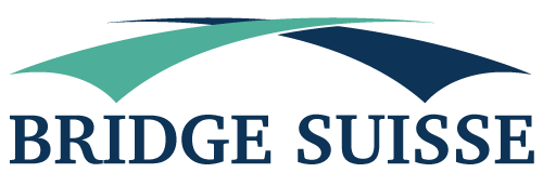
The new logo retains the iconic bridge, symbolizing our commitment to connecting people, markets, and opportunities. It stands as a testament to our history and the trust we’ve built over the years.
What’s different? The new design is more streamlined, representing our focused approach to a select range of commodities. It echoes our philosophy of specialization and expertise, ensuring that we excel in what we do best.
The Color Palette
Our colour palette has also undergone a transformation. The rich, deep blue in our new logo signifies trust, reliability, and a commitment to quality. It reflects our dedication to maintaining the highest standards in every aspect of our operations.

Our Promise
The new logo is not just a symbol; it’s a promise. A promise to continue delivering the highest quality commodities, forging transparent partnerships, and upholding ethical business practices. While our logo evolves, our core values remain steadfast.
At Bridge Suisse, we’re excited about this fresh chapter in our journey. We believe our new logo represents our vision for the future – one that is focused, flexible, and committed to excellence. We look forward to continuing our partnerships and serving our clients with the same dedication and trust you’ve come to expect from Bridge Suisse.
Thank you for being a part of our story, and we’re excited to continue this journey together.


